
7-03-2024
Color is one of the most powerful tools to influence people. Various shades contribute to brand awareness, catch attention, stimulate actions, inspire confidence, and can even boost sales. According to KissMetrics, color is the deciding factor when buying for 85% of buyers. It is important to understand how each color works if you want to resonate with the target audience and influence customers' purchasing decisions.

Colors have different effect on human behavior, brand awareness, and decision-making. The answer is simple — in fact, our brain gets the info through the eyes. Moreover, on a subconscious level, colors conjure up associations. A lot depends on sex, age, stereotypes, individual preferences, subjective emotions, and cultural specifics. Despite some diversities, correctly selected colors
- influence perceptions and attract the target audience. If young people prefer bright colors, the older generation chooses softer shades. Consider desired emotional feedback at first glance on your logo or products. In the end, it will influence the first impression of the company and help unobtrusively shape the desired response;
- help stand out from competitors. By choosing colors that differ from those of your competitors, you will highlight your products in a multi-brand space and make them recognizable;
- change the mood. For example, red color trigger appetite, green one relaxes, and blue one calms down. Take into account the effect of colors on your emotional state, and you will be able to use it to set the mood and create the atmosphere you want;
- boost awareness. By на 80%! The color palette is one of the components of brand identity. At first, brands try to stand out among competitors, then get a foothold in the market, and after that try to form and strengthen associations. Consistent use of color in logos and packaging makes the brand recognizable. And people prefer familiar brands. Red color and Coca-Cola are associated with winter holidays all around the world. Delicate turquoise has become Tiffany&Co’s brand color. The company even registered it as a trademark, Tiffany Blue®. Pantone labels this color «1837 Blue» [the jewelry house was established in 1837].
Successful marketing campaigns rely on consistency and systematization. To get the desired results, you need to wisely choose shades or color combinations for the logo, product packaging, and advertising campaign. The practice and example given above prove that colors are associated with a certain company and form a connection with the brand.
Here’s the list of basic color meanings and associations numerous companies successfully use;
- Red: passion, energy, movement, drive, action. Bold color attracts attention and excitement. If overdone, it can look aggressive. Excellent as an accent color.
- Yellow: joy, optimism, warmth, enthusiasm, movement. The color attracts attention and encourages action, but it is softer than red. It should be used to create positive emotions and highlight new products.
- Blue: calmness, reliability, harmony. This color is chosen by companies that want to emphasize their stability and reliability.
- Orange: joy, motivation, positivity, happiness. It evokes friendliness and is associated with the sun, fun, energy, and creativity. It is often used to attract attention.
- Green: nature, success, tranquility, peace, money. The color is calming and relaxing. It is associated with eco-friendliness and naturalness.
- Purple: harmonizes energy, tranquility, and strength. Symbolizes wisdom, stability status, and sophistication.
- Pink: femininity, youth, activity, and sensitivity at the same time. The color is often chosen by brands that create products for children and female audiences. It is also suitable for the beauty industry.
- White: clean, simple and safe. It can be used solo or in contrasting combinations with different shades.
- Black: strength, sophistication, refinement, elegance. Many consider it too dark, but luxury brands use black in their logos. The versatile color is associated with safety, style and authority.
Check The Color Emotion Guide, infographics by The Logo Company and you will realize why world famous brands choose specific colors for their logos:

When choosing a color palette, consider the cultural traditions of various nationalities. In South America purple color is considered a mournful color, while in Japan, it is a festive one.
Johannes Itten's color wheel can be of use when choosing the main color of your corporate style, advertising campaign, or logo. According to the theory of Swiss artist and art theorist, there are 12 basic colors:
- primary ones include yellow, red, and blue:
- secondary colors are the result of equal mixing of the primary shades — purple, orange, and green;
- tertiary colors appear when analogous and complementary colors are mixed.
With this scheme, various colors can be harmoniously combined.
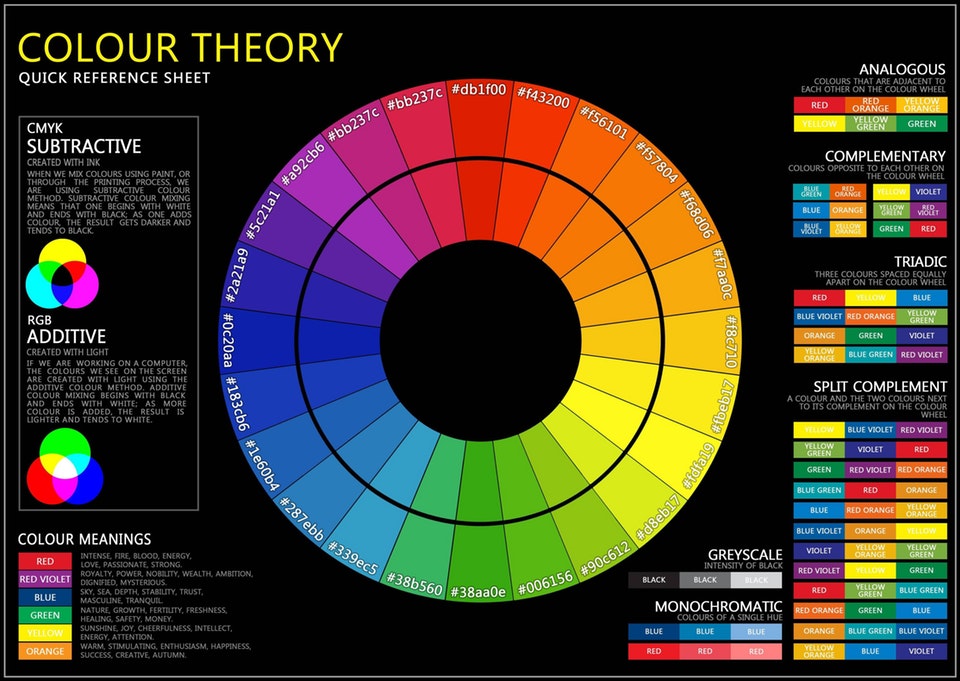
It is worth considering the difference between color temperatures. before experimenting and choosing the main and accent shade:
- warm [orange, red, yellow] uplift and energize;
- cool [green, silver, blue, purple] are soothing, relaxing, associated with coolness and freshness, help to concentrate;
- neutral [achromatic white, black, gray, and brown] stand separately. They have no temperature by themselves but can make cool colors warmer and warm colors cooler. They are usually seen as a symbol of elegance and professionalism.
To get the perfect balance of colors, experts recommend using the "60-30-10" formula:
- 60% is the dominant color;
- 30% is the secondary shade;
- 10% are color accents.
To create your own color palette, corporate colors, a corporate identity, or a brand book, you will need the right tools. For example, Paletton, My Brand New Logo, ColorScheme, and other similar services help you choose the perfect color palette. The RAL color table, developed in Germany in 1927, is used in manufacturing, architecture, and design. By the way, Ustor customers can choose any shade from the RAL palette for their shopfitting.

The colors of the finished retail shopfitting precisely match the customer's brand book and brand color scheme and convey its individuality. Since we use high-quality powder paints, the coating retains its saturation for a long time.

While the color palette is one of many brand touchpoints, it's worth considering the meanings of the hues and their impact on consumers. Think about what associations and emotions you want to evoke in your target audience and potential customers. The right color or combination of colors will allow you to convey a certain message and influence the desired attitude toward the brand.
Customer: “Rosa” online hypermarket of creativity goods Objective: To develop a display which will provide the most advantageous display of goods in a trading outlet and will be convenient for […]
25-05-2016
CASE № 5 DISPLAY FOR CREATIVITY GOODS
In January 2020, Las Vegas hosted the Consumer Electronics Show 2020, a major exhibition focused on home appliances and electronics. Manufacturers showed technologies and products that will definitely change the […]
2-03-2020
[CES-2020] Technology for retail: from smart mirror to a robot waiter
Children’s clothes can be displayed in bottles, on ropes or on floating shelves. In this case, your imagination is the limit. And the designers have proven that many […]
15-03-2019
Display Racks for Children’s Products [14 Examples]
The application has been sent!

Our specialist will contact you as soon as possible